At ToolTime we have (at the time of writing this post) a team of 20 Software Engineers and 3 Product Designers. Smooth collaboration is always a challenge when a team consists of more than, ehm, 1 person 😀. And more problems can become prominent when the collaboration is cross-functional.
Product Designers (PDs) and Software Engineers (SEs) work and think in a quite different way. We (SE) naturally tend to focus on technical solutions and code. Sure, at ToolTime we take part in the whole lifecycle of a feature, but at the end of the day, as SEs we provide a solution using our programming skills. On the other hand, PDs look for ways to provide value to the user by making the features visible, understandable and intuitive via UI/UX.
These two different approaches lead to different vocabulary and processes. Let’s take a look at what tools and environments each uses. PDs at ToolTime use Figma for creating mockups and the design system. SEs use code and they see the visual result of their code in the actual app. This comes with a question: What is the source of truth for the design? The Figma mockups or the actual code that is deployed to production?
Figma comes with the disadvantage that it’s quite distant to the SEs, as it's not their everyday's tool. Same applies to code, where PDs struggle. Moreover, it may take quite some time for PDs to be able to review the implemented design since they have to wait for a preview URL and use the entire product in order to check the design of one feature or design system component.
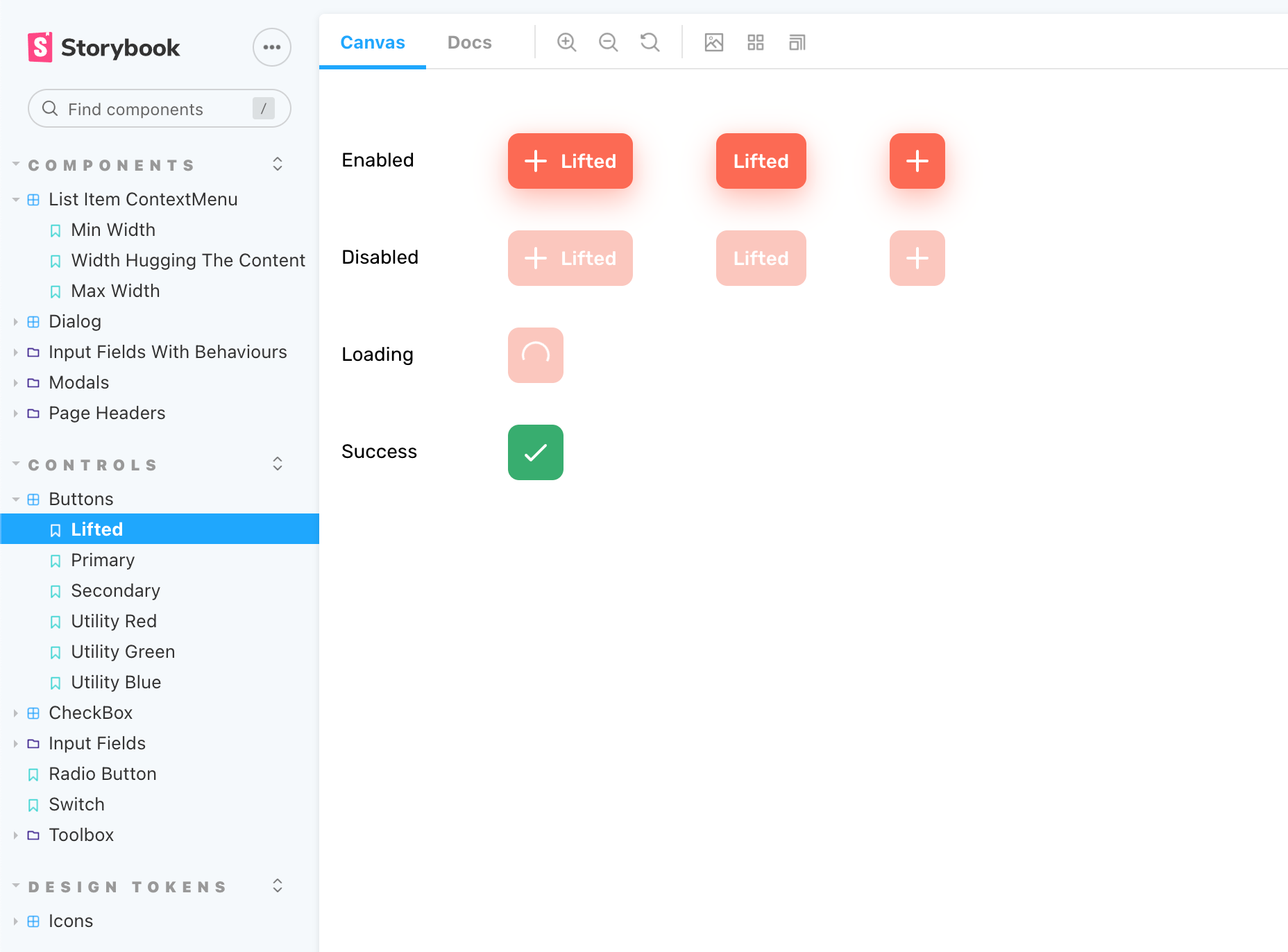
We decided to solve this problem by adding something in between that is easy for both sides to use and making the source of truth for the design that is deployed to production. We chose Storybook as our tool that displays our design system and we feel very justified by this choice.
Why Storybook
Storybook is a widely known tool, test-proof and fits our purpose very well. We can run it both locally and have it on the cloud for easier access as well via Chromatic. In addition, it is not opinionated and we can give it any shape we need, in close collaboration with our PDs.

Another advantage of Storybook is its stories files. They can be used as a reference for our SEs as we can, most of the times, just copy/paste the code from a story to our actual code.
Chromatic reviews
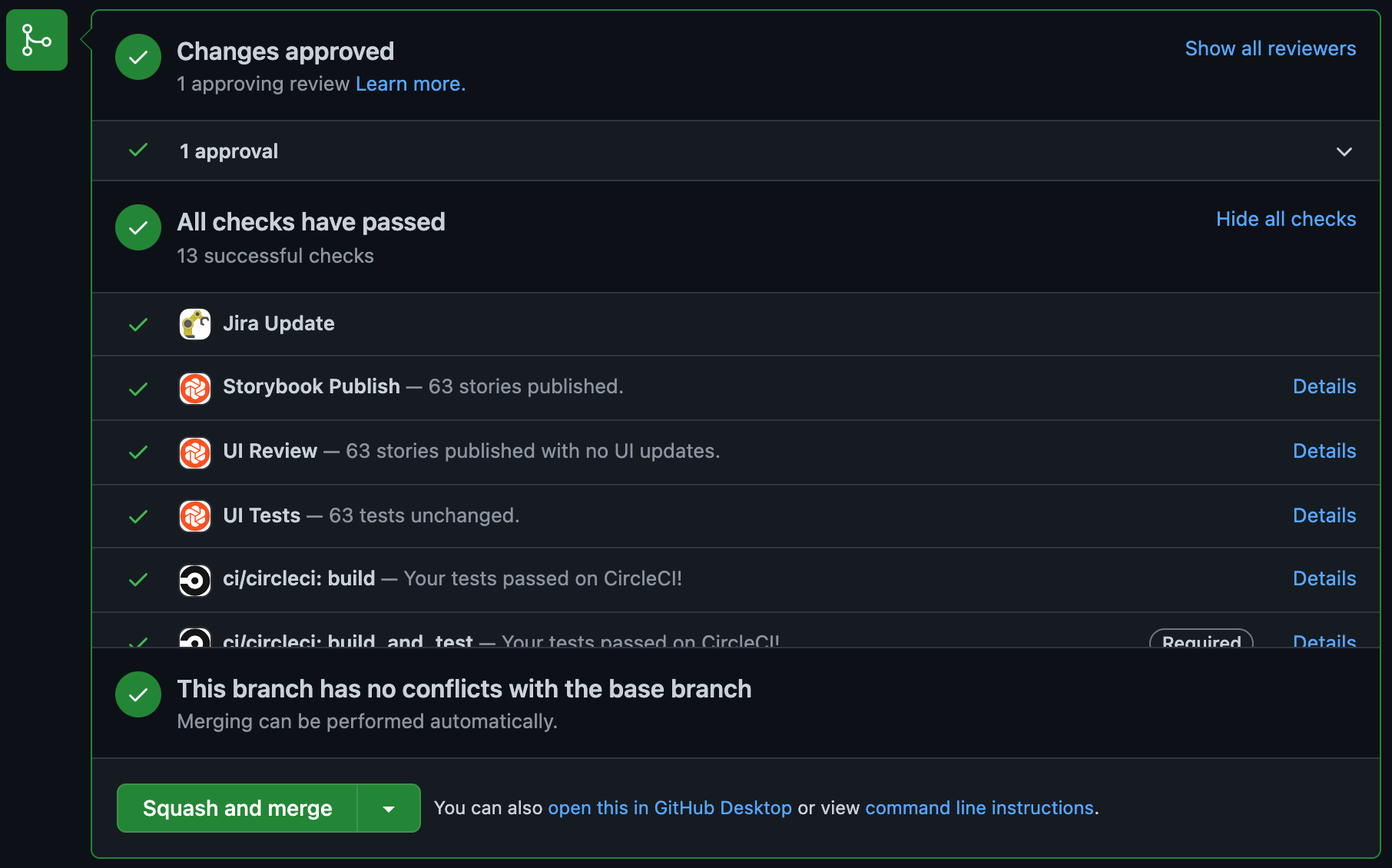
Every time we push code to a git branch on Github, Chromatic checks if there were any changes that resulted to different design in Storybook. If that’s the case, a design review is required, which can be performed only by our PDs. They can see the changes, comment, accept or reject them. This way we make sure that any design system change is approved by our product team first.

What’s the result?
The quality of the developed UI as well as consistency in the product increased by a lot. The collaboration between our design and engineering teams improved and became smoother and more efficient. Most notably:
- The vocabulary became consistent
- The source of truth for design system components isn’t on either team’s side, but in the middle
- We can implement and review our design system independently from the product
- With Chromatic, PDs are in control of new implementations and changes
- SEs can use the stories as reference for their code
- Easy and transparent cross-functional collaboration 🎉

